This page serves as the official brand guidelines for Dr.nuMe and is intended for internal use only. It provides a comprehensive framework to ensure brand consistency across all communications and marketing efforts. By adhering to these guidelines, team members and partners can maintain a cohesive brand identity, ensuring a unified message and look across all platforms and materials. Please use this as a reference to align with Dr.nuMe visual and messaging standards.


Dr.nuMe Brand Guidelines
Content
Logo Usage
Guidelines on how to use the Care RX logo, including acceptable variations, sizes, and clear space requirements.
Color Palette
Detailed breakdown of the primary and secondary colors with hex, RGB, and CMYK values.
Typography
Fonts and typefaces to be used across all brand materials, including specific usage scenarios.
Graphic Elements
Additional design assets and icons to support the brand's visual language.
Imagery Style
Best practices for selecting and using imagery that aligns with the Care RX brand identity.
Logo
Symbol

Logo Usage
This document will serve as a guide to rendering the Dr.nuMe logo and wordmark properly in every situation. Use this set of rules to ensure consistency across multiple mediums.
The Dr.nuMe logo should always be viewed together as a single entity and never separated.
Both the long and short versions of the logo are accepted, which is made up of the central elements that form the letter “u”.
There must be an exclusion zone of a minimum of 114 pixels or the height and width of the letter "n" around the logo when used digitally.
The logo should be rendered in full color when possible and should be used in solid black and white when full color is not an option.
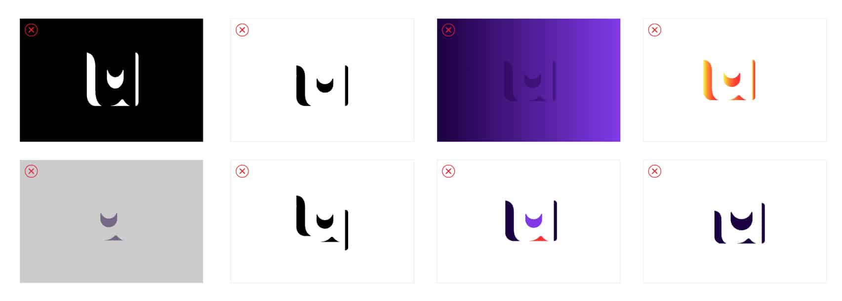
Logo Usage
Use the examples below to ensure consistency and accuracy when using the Dr.nuMe logo in any application/media.
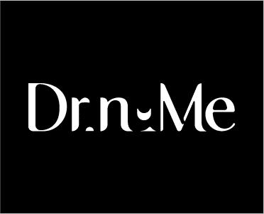

When used in black backgrounds, use white logo.
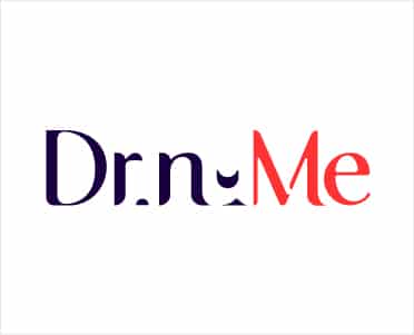

When used in white backgrounds, Use full color logo (#1d3e67).
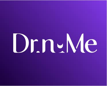

When used in colored backgrounds, Use solid white logo.
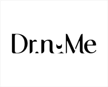
When color is not allowed, Use solid black logo in white & grey backgrounds & solid white logo in black backgrounds.
Logo Usage (Not-Allowed)
Use the examples below to ensure consistency and accuracy when using the Dr.nuMe logo in any application/media.

• Never compose again.
• Never change the position of the elements.
• Never place the logo inside a shape smaller than the minimum protected space.
• Never change the colors of the logo.
• Never use strokes or outline the logo.
• Never place the logo on a colored background that does not use the brand's approved colors.
• Never use a logo on an image that is not related to the brand.
• Never use logos in colors or gradients that are not specified in this document.
Symbol Usage (Not-Allowed)
The examples below help to prevent misuse of the symbol. Never combine the sYmbol with any other taglines, or with the logos of other companies. The symbol must stand alone and always follow the exclusion zone guidelines.
• Never compose again.
• Never use remove any symbol element in any presentation.
• Never alter the proportion or dimensions of the symbol.
• Never use solid strokes and blocks when presenting the symbol.
• Never use gradients when presenting the symbol.
• Never change the position of elements when using the symbol.
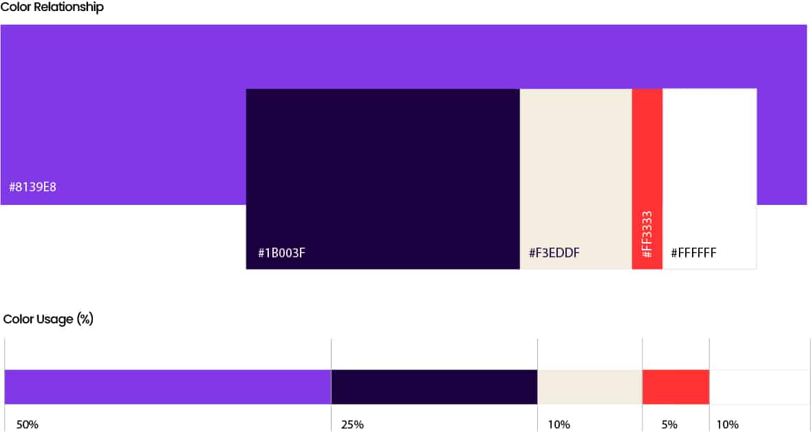
Dr.nuMe Color Palette
Hex Code: #1B003F
Pantone: 2765 C
C: 100% M: 100% Y: 37% K: 54%
R: 27 G: 0 B: 63
Hex Code: #8139E8
Pantone: 814 U
C: 76% M: 78% Y: 0% K: 0%
R: 129 G: 57 B: 232
Hex Code: #FF3333
Pantone: Warm Red C
C: 0% M: 87% Y: 75% K: 0%
R: 255 G: 51 B: 51
Hex Code: #F3EDDF
Pantone: 11 0103 TCX
C: 6% M: 6% Y: 15% K: 0%
R: 243 G: 237 B: 223
Hex Code: #FFFFFF
Pantone: 000C White
#8139E8
#1B003F
#8139E8
#FF3333
#8139E8
#FFFFFF
• RGB values can be used to set the colors on your PC for everyday documents created on MS PowerPoint, MS Excel and MS Word.
• CMYK values should be used for all print media.
• Solid-coated Pantone values should be used for matching color fabric swatches and when printing all branded corporate clothing and gifting.
• HEX values are to be used for all digital and web-based design.
Dr.nuMe Color Hierarchy
Dr.nuMe Primary Color Hierarchy
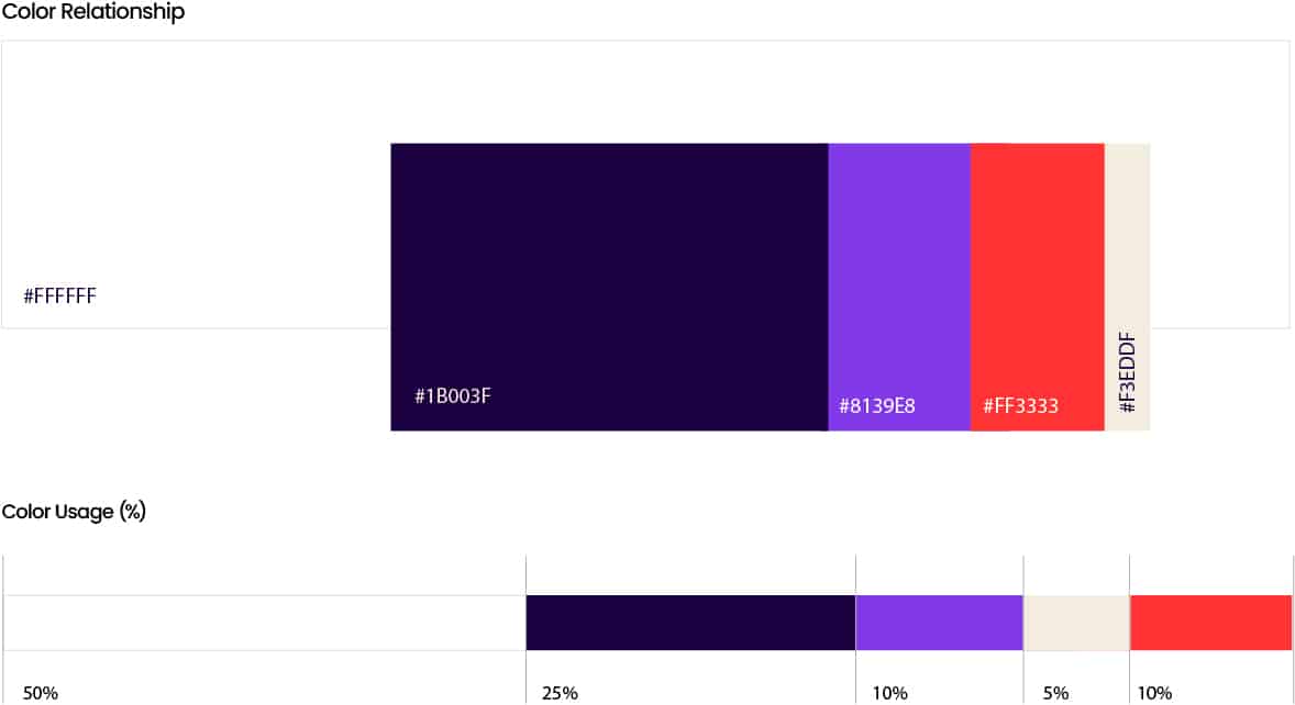
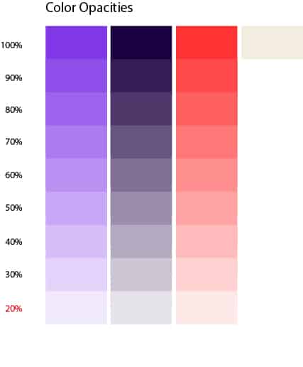
It is recommended to manage the opacity of the colors up to 20%, and in the case of the cream color (4th color), always use it at 100% of its opacity.
Dr.nuMe Complimentary Color Hierarchy
It is recommended to manage the opacity of the colors up to 20%, and in the case of the cream color (4th color), always use it at 100% of its opacity.
Dr.nuMe Color Gradient Guide
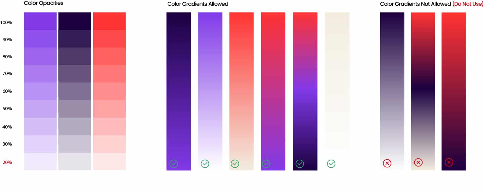
• Use of gradients must be directly proportional to the hierarchy of colors (Do not exceed the use percentage of each color).
• Avoid overuse of gradients in any application.
• Gradients are complimentary to the color palettes, Do not make these the primary color of the brand.
• Colors can only be used in different opacities when there is a solid (100%) representation of the same color in the creative.
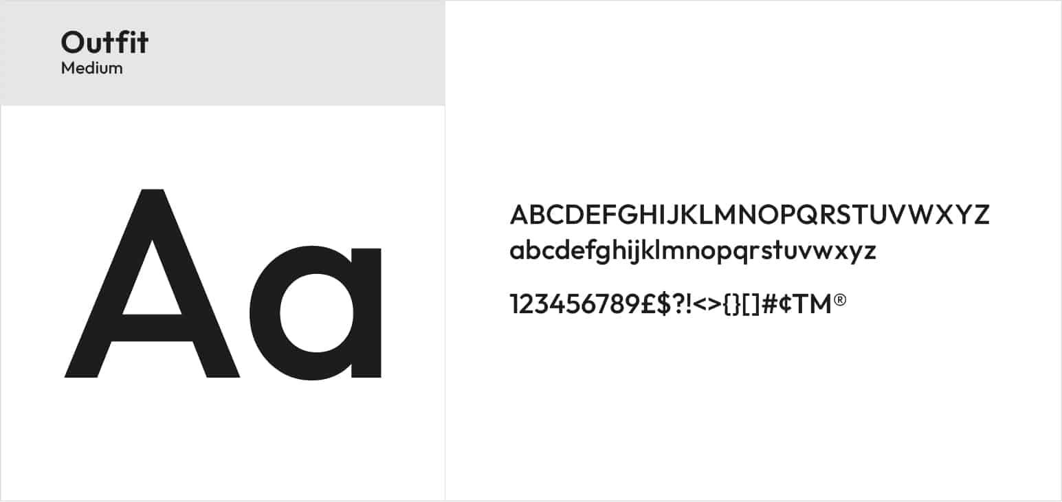
Typography
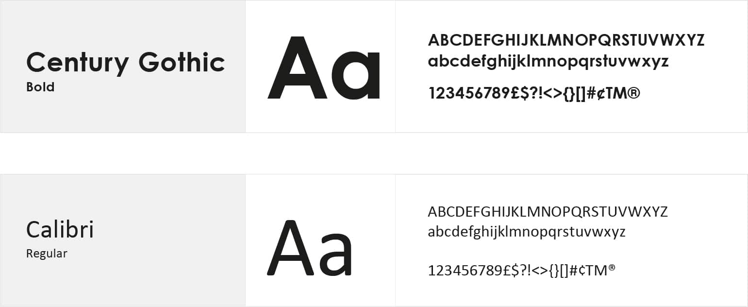
Headings & subtitles font family
Body Copy Font Family
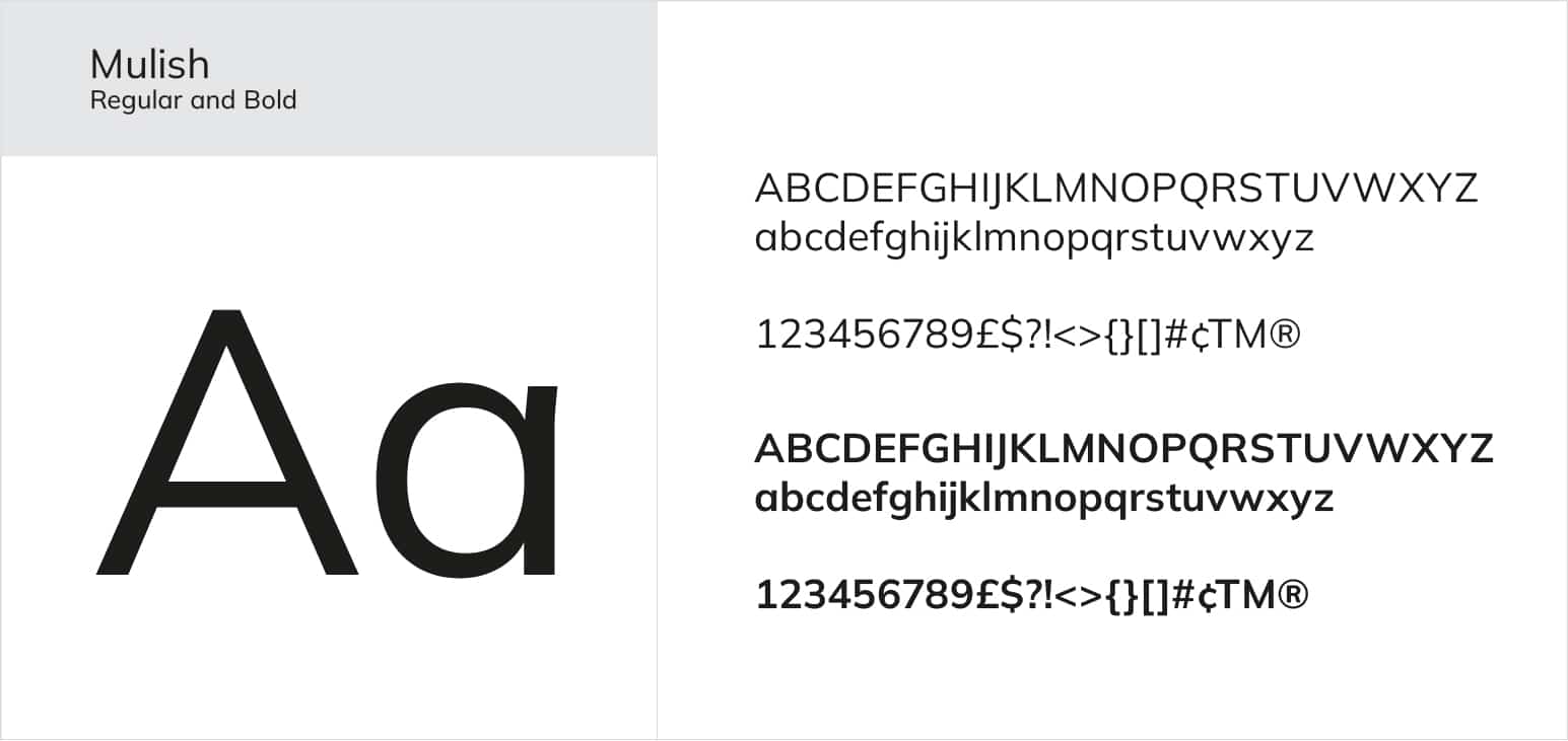
Use these fonts ONLY for titles and body copy where there is limited customization options like emails.
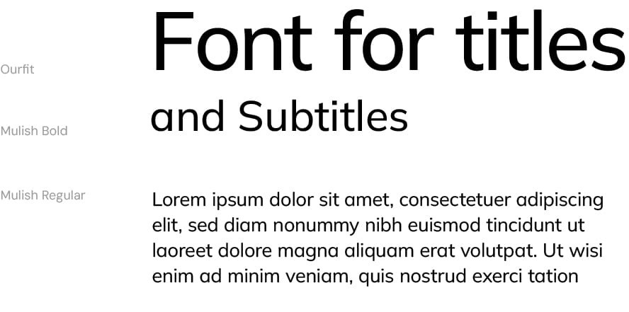
Recommended font pairing for web
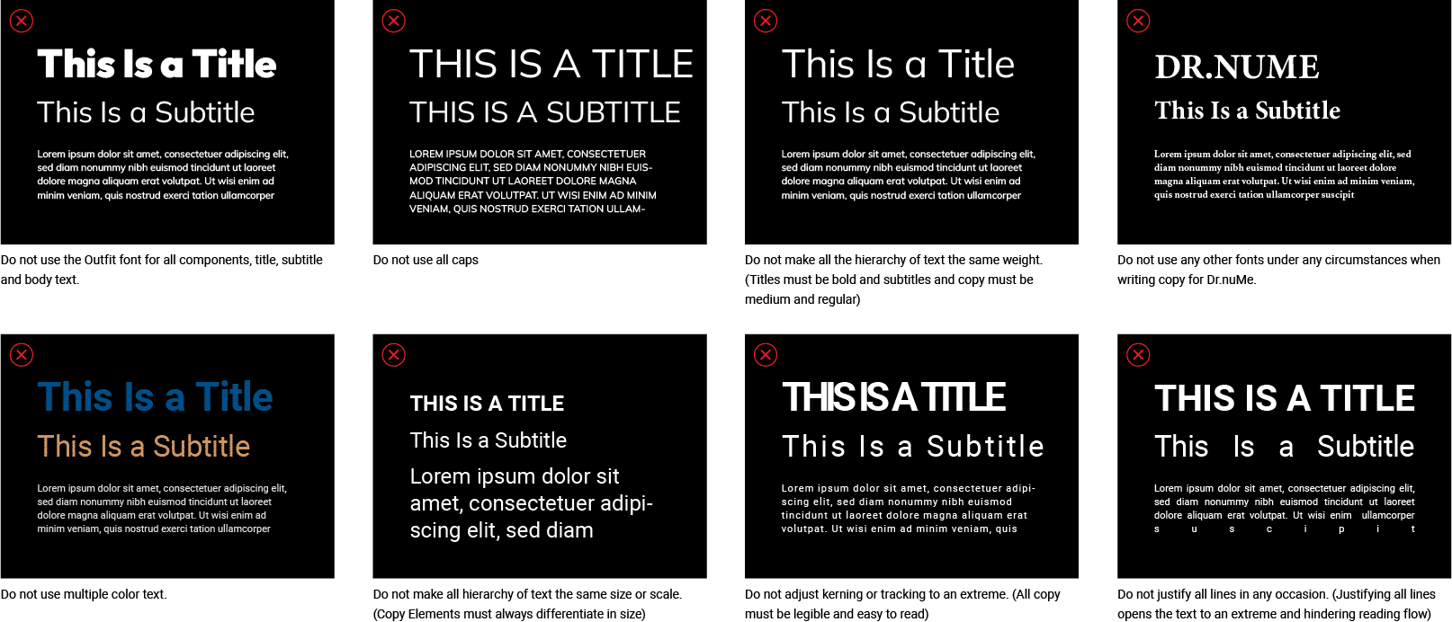
Not recommended

Brand Immersion
Brand Landscape
Promises and communication of
your brand
Competitive Review
Learn where Dr.nuMe stands in the industry
Messaging
What and how Dr.nuMe should communicate
Persona Profiles
Get to know Dr.nuMe target audience
Dr.nuMe 2025 Copyright © | Created by Emerge BBCO